Reviews
5 Core Elements of A Winning Landing Page
5 Core Elements of A Winning Landing Page: Stunning. Effective. Magnetic. Definitely conversion-boosting.
These are the words we want to hear when people talk about our landing pages.
Well, and we can probably also add totally awesome to that list too.
Because your landing pages are such an indispensable part of your funnels, we don’t just want to hit and run when it comes to learning more about them.
In previous articles, we’ve dug deeper into making our landing pages action-focused.
We’ve also learned more about how a well-chosen backgrounds can “wow” your audience.
But I’m never one to also pass up the fundamentals.
The truth is… an overwhelming number of businesses are not using landing pages effectively or to the full extent possible.
Even pros report that building good landing pages is one of the top 5 challenges that they face.
But we’re going to break out of that mold to make sure every last piece of our landing page, from the biggest to the smallest, is optimized for one thing… converting.
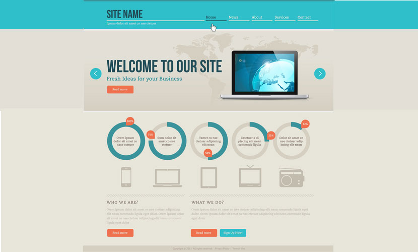
An Engaging Headline and Subtitle
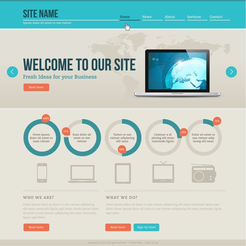
When you’re browsing examples of high-converting landing pages, you’ll notice that there are almost none without a headline.
In fact, about 100% of them will have a headline, and many will have a subtitle to go with it.
And while it’s perfectly fine to think outside the box, headlines that draw in an audience have a bit of a formula.
Of course, it’s not hard to see how those big, bold words get your attention.
Still, there are a few more points to consider when crafting your own.
- Short, Sweet, and to the Point
The size of your headline and subtitle isn’t the only reason that they work so well. Because they rely on short, easily consumable content, you’re able to orient yourself on the page in a flash. And that’s a big deal. Most of your audience isn’t going to be speed readers, and with the average adult only being able to read a few hundred words in a minute, you want a headline and subtitle that are pretty short. This way, your audience is on the right path within seconds of landing on your page.
- The Perfect Placement
Your headline and subtitle are also some of the first things that your audience will see. What good will these key ingredients be if they’re stuffed in the bottom right-hand corner or in some other odd spot? Instead, think about how your audience naturally consumes information. We read top to bottom and left to right, don’t we? So when we place these elements on the left or center, toward the top of the page, we guarantee that our leads can process them faster. This general principle is: placement is primary.
- Focus on Creating an Impact
You probably don’t have to guess that you’ll also want to choose words that make an impact. Yet, time and time again, I see landing pages with dry, boring content. Instead, get creative. Ask a question or make a promise. Try alliteration or give a compelling reason. Whatever you do, don’t forget to consider adjectives that spice up your content and give it that extra special punch.
Protip: Use your headline to ensure your audience has a lightning-fast connection with your brand by imagining things from their perspective.
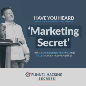
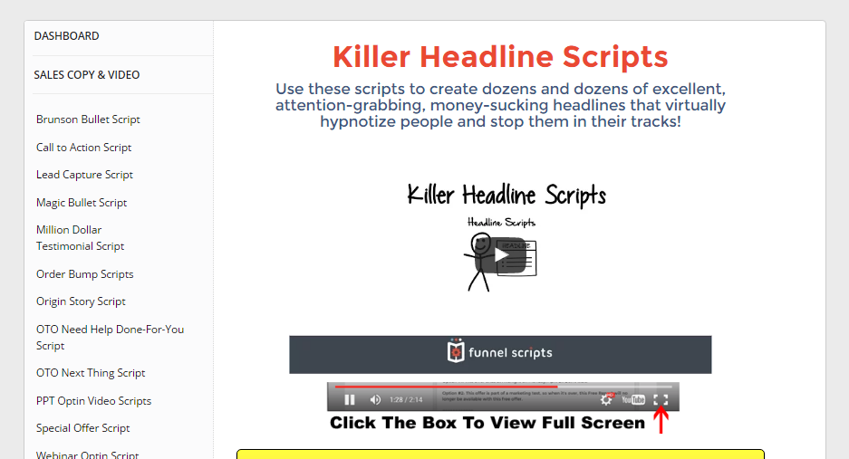
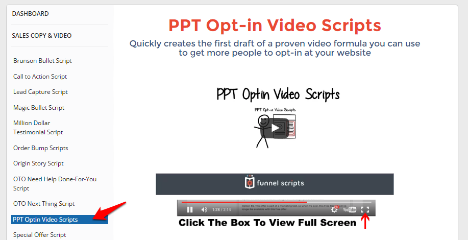
Create a high-impact headline and subtitle with the help of Funnel Scripts. Click here to register for a copy if you haven’t got one yet.
A Story with an Authentic Purpose
In addition to your headline and subtitle, you’ll also see another core element that’s often used. And that’s a story. This content should also still be incredibly short (you’ll even see some content that’s only a sentence or two). Feel out what’s right for your landing page, but here are a few must-haves for including content that’s authentic. This way, your audience gets more context and the full purpose of your page.
- Illustrate the Need
What’s a product or service without a need to fulfill? Using a small amount of body copy to remind your audience of their need helps to set the page up for success. It also shows how, through every step of your funnel, you’re in tune with what they’re thinking and feeling.
- Your Value Proposition
Chances are, you’ve heard of value propositions. You’ve created the need, now you also want to provide the solution. For brands, value propositions laser in how you’re able to solve their issue or improve their lives uniquely. It also gives the customer the “why” for choosing your product or service. Working it into your body content should be considered at the very least.
- Giving Them Social Proof
This space is also a good time to provide social proof if you haven’t done so already elsewhere. And it’s a powerful motivator for lead conversion. Whether you mention the growing movement behind your offering or mention the satisfied customers who love your product, you’ll be nudging them in the right direction.
Protip: To circle back around, I can’t reiterate enough that this section can also be very short. Although it probably won’t be as short as your headline or subtitle, it’s not a place to go on for too long. A handful of sentences at most should do.
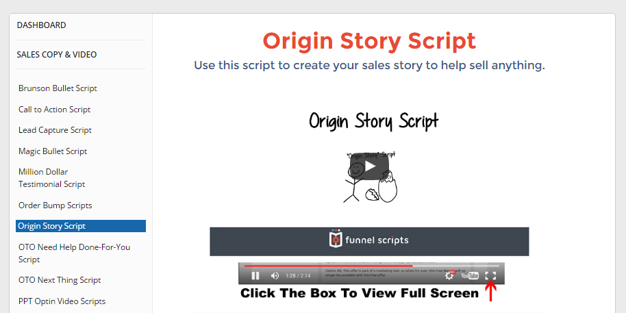
You can try your hand at creating the story yourself or you can try using Funnel Scripts which lets you create origin story scripts.
A Bullet List for Your Audience
Now it’s time to hit them with a list of amazing points. If they only read our headline and then skim our bullet list, they’ll still be exposed to some strong marketing.
This is especially true when we choose from some of the items below when creating our list.
But the strategy is pretty simple: a shortlist presents an organized menu of reasons to convert your audience right now.
- Some of Your Biggest Benefits
If you’re new to the sales funnel or marketing sphere, you’ll want to ensure you know the difference between features and benefits. As the saying goes, “features tell and benefits sell.” So they’re going to be a huge part of our landing page. While your value proposition might include a benefit or two, breaking out a list takes your page to the next level. They’re some of your strongest selling points after all, right?
- Positive Testimonials
We may have mentioned some social proof in our story, but this core element proves what we were saying. In fact, our audience sees that we aren’t joking… people are raving! You can’t argue with the facts either. Adding extra social proof, concrete social proof from real people will always win the day.
- Hard-hitting Facts, Stats, or Data
And of course, a list can be the perfect place for these three. This is because, when you try to weave facts, stats, or data into other copy, it tends to be… well, a little bland. Using a bullet list to show your audience how 99% of people cherish your product or service or how your brand has helped boost profits by 45%… those numbers convince people. Use them.
Protip: If you haven’t gotten the idea yet, we’re focusing on short, short, and short. For most landing pages, a bullet list between 3 and 6 points long will do nicely.
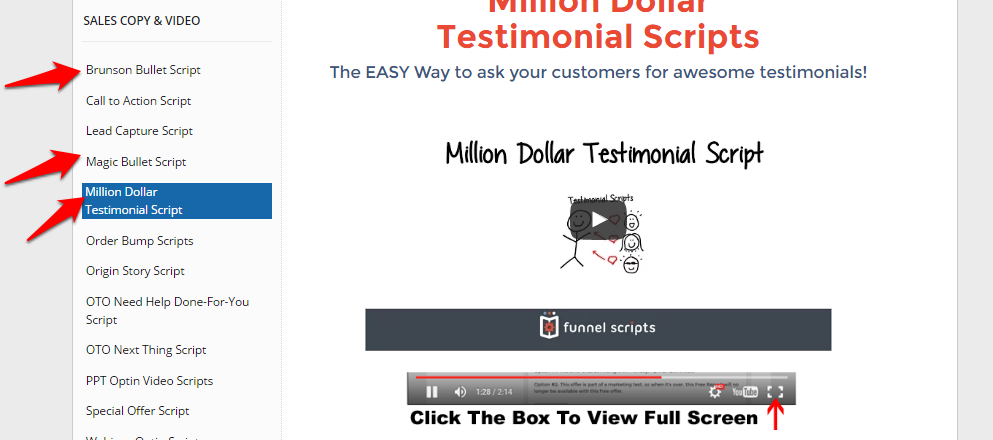
Be it copy for asking your customers for testimonials or bullet scripts, there’s an available generator for that if you use Funnel Scripts.
A Dynamic Video or Image
When I show off examples of unbelievably good landing pages to new funnels, there’s one core element they all pick up on right away. And that’s the images (and of course, videos). Dynamic, impressive, bold, intense. Those are some of the words that you’ll often hear. There’s also plenty of research and data to confirm how important these elements are to a well-crafted landing page. Once we add in a few concepts to guide our image or video selection, we’ll see higher conversions for sure.
- Use People and Landscapes
This strategy is a true award-winner. The numbers show that using images like these can turn a regular sales funnel into a supercharged, high-powered converting machine. And it’s not hard to figure out why this is the case. On the one hand, we want to see other people enjoying themselves. And on the other hand, landscapes offer a soothing, yet awe-inspiring vista that engages us.
- Choose Correct Sizes and High-Quality Versions
You’ve probably seen this mistake before. Maybe an image was pixeled a little. Or a video was just too small to really get a sense of what was going on. You’ll still want to keep your loading times in mind when choosing your images or videos, but balance that factor against presenting a clean, big impact landing page.
- Tie in the Feeling
The final consideration when choosing your images or videos is to think about the experience you’re trying to create. And yes, even if a landing page is a single-use, narrowly-focused type of site, it can still convey a feeling and offer a voice that your audience will hear loud and clear.
Protip: Today, you’ll see many marketers just grabbing images or even videos from the web, without consideration of copyright. There are plenty of services out there that can provide you with quality content if you need but without the risk.
Video Scripts, you say? Funnel Scripts has you covered.
One Single Call-to-Action

Finally, this one is probably one of our most important core elements.
If you have multiple calls-to-action, it’s almost like you’re competing against yourself.
Plus, you’ll also find it’s more difficult to crunch your numbers and assess your true conversion data.
If that wasn’t enough, your audience could easily get confused. It’s not that they’re not intelligent; in fact, just the opposite.
They have a limited amount of time and effort. Why complicate the process for them?
- Decide If You’ll Use a Form or Not
Forms are one popular part of the call-to-action process. You’ll see landing pages that capture an email and name before a lead can download an ebook. Or maybe a form will even ask a lead to answer some psychological type questions before they request a consultation. There’s no right or wrong answer here. Just remember the more questions, the fewer chances of converting (which might be fine with higher ticket funnels with specific purposes). But for us, we want to keep them in mind at least, so we can retarget later.
- Make Sure Your Buttons Contrast
I can’t tell you how many times I’ve seen a call-to-action button that wasn’t the correct color. Or wasn’t even a button! In those cases, think about what that landing page is missing. If we’re aiming to get our audience to complete a single action, driving everything home to that one action… doesn’t it make sense to highlight that action? Definitely, consider some contrast to your call-to-action.
- Put in Extra Effort with the Prompt
Click here. Shop now. Sign up. Is this the best we can do with our calls-to-action? The core elements of our landing pages can be so very much better. Browse these examples of totally creative calls-to-action, and you’ll see exactly what I mean about kicking it up a notch or two.
Protip: If you’re a little hesitant to go with one single call-to-action, consider this example. Just like adding way too many exclamation marks to your emails has the opposite effect that you want, putting in too many call-to-action cheapens all of them.
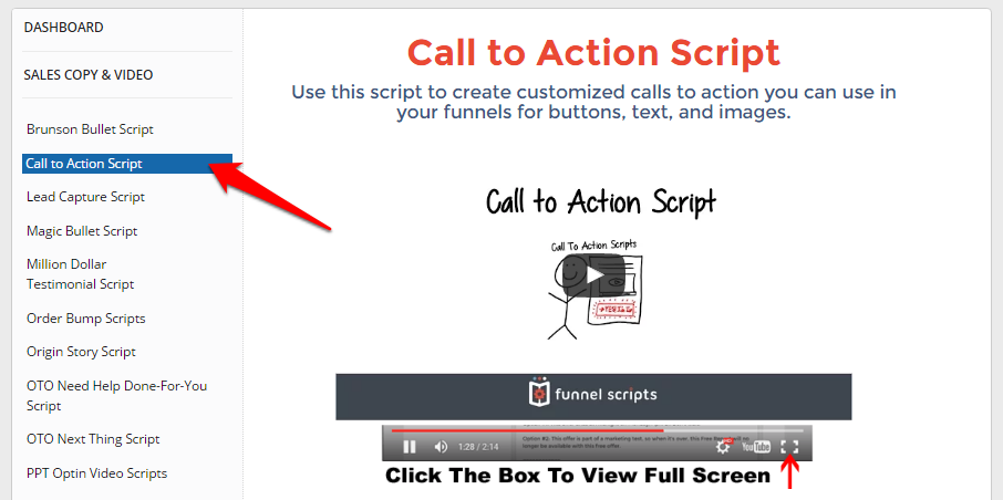
Generate high-converting CTA scripts with Funnel Scripts!
I’m sending it back your way: what are some examples of the best (and maybe even worst) landing pages you’ve ever seen?
>>>Join The One Funnel Away Challenge<<<