Free
5 Best Landing Page Design Ideas
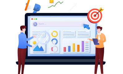
Did you know that the way your landing page is designed can make or break your chances of turning visitors into subscribers or customers? It’s true! That’s why it’s crucial to brainstorm and come up with amazing landing page design ideas before you start creating.
While there’s no one-size-fits-all formula for creating stunning and effective landing pages, there are proven principles you can follow. In this guide, we’re sharing 5 successful landing page design ideas and why they work. By the end, you’ll have all the tools you need to create landing pages that showcase your brand and convert visitors.
What makes a landing page design successful?
To ensure your landing pages not only look great but also perform at their best, you need to understand the key design elements at your disposal.
A successful landing page design seamlessly incorporates these elements, creating a cohesive experience that helps you achieve your goals of strong branding and attracting new subscribers or customers.
Ready to get started? Let’s go!
#1: Visual Hierarchy
Guide your visitors’ eyes where you want them to go by strategically arranging elements on your page. Pay attention to the order in which your eyes naturally move and eliminate any distractions.
#2: Use of Colors
Colors have a powerful impact on people’s emotions and actions. Make sure to use contrasting colors for your calls to action to make them stand out. And don’t forget to consider the psychology behind each color choice.
#3: Consistent Typography
Fonts play a crucial role in how easily visitors can read your message. Stick to legible fonts that are consistent across different devices. Ask for feedback to ensure they’re easy to read and enhance your design.
#4: Use of Images
Images grab attention faster than words. Opt for high-quality, relevant images that enhance your design and avoid generic stock photos that can take away from your message.
#5: Mobile Responsiveness
Don’t frustrate your mobile users with non-responsive designs. Make sure your landing page is easy to navigate and scroll through on any device. With ClickFunnels 2.0, you can easily test and adjust your design to ensure it looks great on desktops, mobile phones, and tablets. Remember, a responsive design is crucial for maximizing conversions.
#6: Whitespace
Create a clean and organized design that is easy on the eyes. Properly utilize white-space to give visitors a break and guide their eyes to key elements. By avoiding clutter and providing breathing space, you make it easier for visitors to scan your message from top to bottom. Check out the example below to see the power of whitespace in action.
#7: Encapsulation
Make important elements stand out by using encapsulation techniques. From boxes and borders to arrows and contrasting backgrounds, find creative ways to draw attention to specific parts of your message. By encapsulating key information, you can guide your visitors’ eyes exactly where you want them to go. Take a look at the example below to see how effective encapsulation can be.
5 Landing Page Design Ideas That Guarantee Success
Ready to create an attention-grabbing and effective landing page? Let’s take a look at some of the best designs we’ve come across and why they work so well.
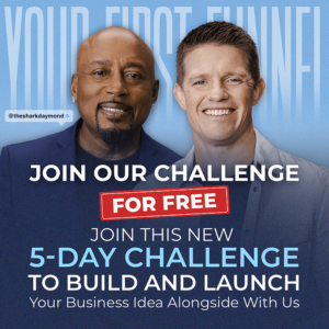
1— Split Layout: The Perfect Combination of Readability and Visual Appeal
The split layout is a tried and tested design that guarantees results. It effortlessly guides the reader’s eye and allows for clear delivery of your message through bullet points. Plus, it includes a stunning visual representation of your product or service. Check out the example below to see how it’s done:
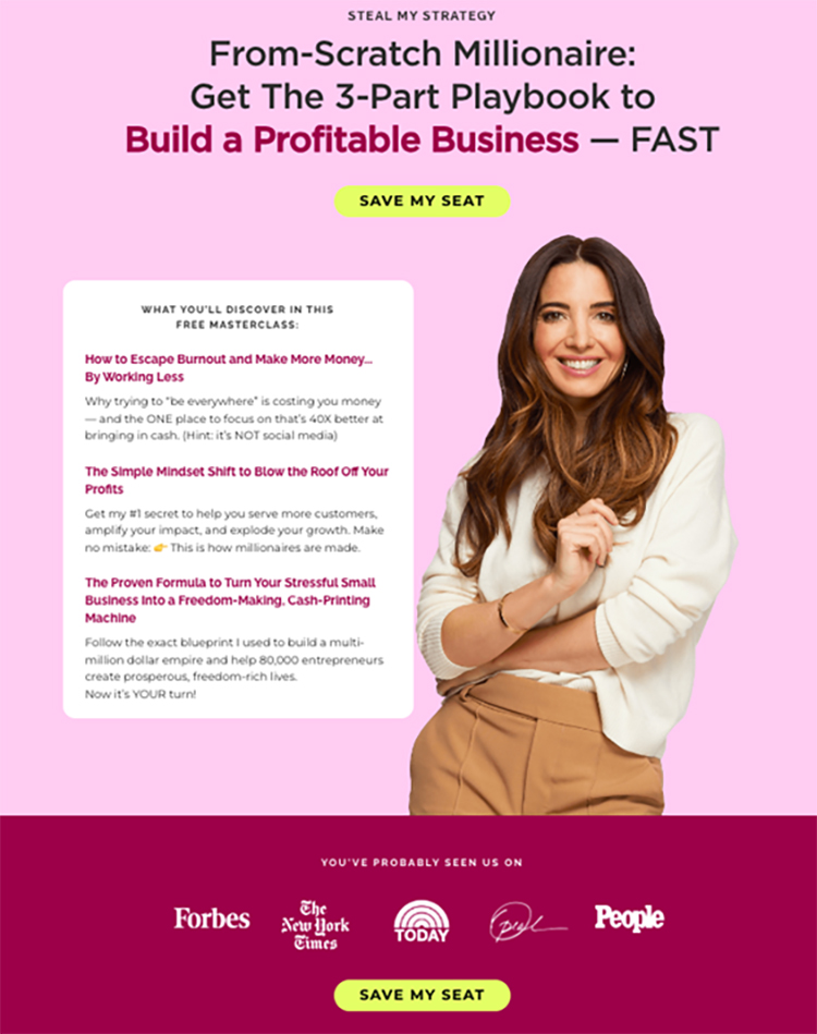
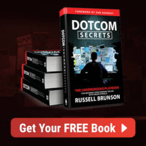
For a more toned-down version of the split layout, take a look at this example:
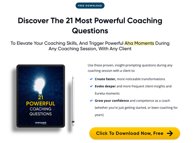
Whether you’re offering a free service, a lead magnet, or a simple page with one offer, the split layout is a surefire way to create a compelling design.
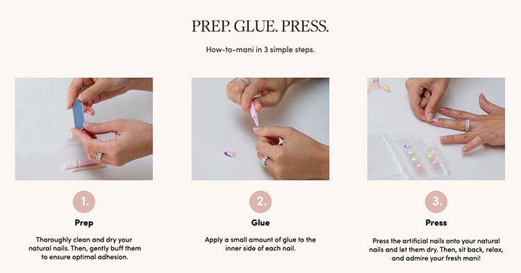
2— Zig-zag Layout: Engage Your Visitors with a Rhythmic Flow
The zig-zag layout is a genius design that keeps your visitors engaged from start to finish. By alternating between text and images in a staggered format, it creates a captivating visual pattern and ensures a balanced page. Just take a look at this fantastic example:
As you navigate through the zig-zag layout, notice how your eyes flow effortlessly from headline to bullet points, to featured images, and finally to the call to action. It’s a design that keeps your visitors hooked and ready to take action.
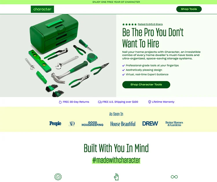
3— One Column Design: Simple and Straightforward
When it comes to simplicity and effectiveness, the one-column design is unbeatable. With a clean and distraction-free layout, it provides a seamless flow from top to bottom. Take a look at this example:
This design focuses on capturing attention and stacking up the benefits, without any unnecessary distractions. Visitors are immediately drawn to the hero shot, then guided to the headline and the big benefit they can expect. Credibility and authority are built through recognizable faces, and the benefits are presented one after another. It’s a straightforward and powerful design.
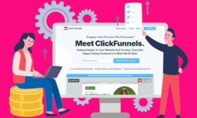
Building landing pages with a single column layout is a breeze, especially with the drag-and-drop editor of ClickFunnels 2.0. No coding or design experience required! In fact, ClickFunnels provides dozens of pre-built designs that you can easily customize. Give it a try with a free trial by clicking here.
4— Use Directional Cues:
To ensure your visitors’ eyes go where you want them to, employ directional cues. For instance, an arrow pointing to a testimonial guides users in the right direction.
The arrow directs attention to all the universities that trust our service.
Marie Forleo also uses arrows to guide users to the next step:
Marie Forleo’s example uses arrows to guide users to the next step.
Lines can create pathways, guiding your visitors from one section to another or from the headline to the copy beneath, like this:
Lines can guide your visitors from one section to another.
You can even use arrows in your call-to-action button to indicate the next step:
Or, use arrows in your CTA to show the next step.
The key is not assuming your visitors know what to do next. Directional cues serve as gentle reminders to take action and reinforce desired behavior.
5— Mix Typography:
Typography helps convey your brand’s tone and personality.
Smaller, lighter fonts create a casual feel and add depth to your message.
Combining emojis or symbols adds character and reinforces tone and emotion.
However, ensure your typography doesn’t distract but rather enhances your message.
Italics emphasize “yours” and encourage readers to take ownership of the benefit.
Contrasting bold-weight fonts capture attention and draw focus to the emphasized text.
The goal is to guide the reader through the message without overwhelming them.
Fast-Track Your Design Process with ClickFunnels Templates:
If you want to create stunning designs quickly, explore ClickFunnels 2.0 and its pre-made templates.
Fast-Track Your Design Process with ClickFunnels Templates
Each template is customizable to match your branding. Modify text, colors, formatting, and images effortlessly.
Drag-and-drop functionality ensures a perfect layout across different devices.
Save time and achieve great results with templates that are proven to look fantastic and drive high conversion rates.
For successful landing page designs right from the start, click here to start your free ClickFunnels 2.0 trial and access dozens of ready-to-use templates.
>>>Join The One Funnel Away Challenge<<<