Guides
What is a Squeeze Page?
A squeeze page is an exciting way to get visitors hooked on your offer. These types of website pages have a much higher conversion rate than landing pages because they focus the visitor’s attention and eliminate distractions by narrowing in on one specific action that you want them to take, such as subscribing or buying.
Squeeze Pages:
– Give away some type of information about “x” product for free before requesting more contact from the potential customer (e.g., email address) with another form requiring payment details if interested – With this method, it is easy for customers who would rather not give their personal data up first thing know exactly what they’re getting into and whether or not it suits their needs prior making any commitments
Squeeze Page vs Landing Page
They’re an essential part of running an internet business and executing a successful internet marketing campaign. And that’s large since you can better target your audience and convert when you use the perfect type of page. It is simple, really. You wish to use the most effective medium to deliver your message.
So, although it’s just language, it is something which you certainly want to take a moment to fully understand. Along with the distinction can be extremely tough, even for some experienced specialists, because they both serve the same function: Capturing user information.
Both pages concentrate on getting users to fill out a form to collect their names and email addresses, but a landing page will have different elements that provide further explanation on product information, whereas a squeeze page is more laser-focused on capturing the user information. So, while all squeeze pages are landing pages, not all the landing pages are squeeze pages.
What is the Purpose of a Squeeze Page?
If you would like to create a page for your website which focuses on a single offer, then a squeeze page is probably right for you. It’s most often the very first page that a visitor lands on, after clicking on your advertisement.
The easier the better, if you will. It has to have a consistent look and feel to the rest of your brands, such as easily identifiable colors and logo, but the page itself mustn’t have any long-form content or perhaps additional links — because that will divert and possibly redirect visitors away from the webpage.
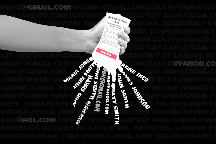
You want to ensure, from a user-experience standpoint, that a visitor would feel almost immediately compelled to enter their name and email address into the page form. Harder than it sounds, we know. But that is the main objective of a squeeze page, to”squeeze” or solicit email addresses from prospective customers.
The most common way of doing so, is by offering a freebie in exchange for something of a high perceived value, such as for example, an ebook. The freebie itself should talk to a pain point that you already know your intended audience gets, which your product/business can ultimately solve when you retarget them in future campaigns.
The intention of a squeeze page is to”squeeze” information in the visitor, but why? A well-designed squeeze page is an integral part of a fantastic list-building and lead generation strategy.
A squeeze page is very much like a landing page in design principles, as both must possess an enticing header and a powerful call-to-action. But the difference lies in the copy. On a squeeze page, there are usually just a few, short bullet points.
A squeeze page also has no extra distractions, such as menu navigation links or options, to improve the odds of the visitor finishing the opt-in form. Have a look and click on to this web page which follows the textbook formula for a high-converting squeeze page:
What Can I Expect From a Squeeze Page?
Assuming that you are new to digital advertising, you might be surprised to find that the average conversion rate of a squeeze page is around 2%.
Do not let that figure discourage you, as a mere 2% can still be mighty effective if you have a leading funnel to nurture your leads and close sales. There is also some advice that will help you optimize your funnel and improve your conversion rate, as the top squeeze page strategies have a conversion rate of 3-5 times the average. We’ll list some of those tips at the end!
Another useful thing to bear in mind is that it truly is not always about quantity. Yes, naturally, you will want to have as many people opt-in to subscribe to a list but more accurately, you want as many of your ideal customers to opt-in.
Numbers are not the only objective, so direct some of your focus towards optimizing your articles and that will increase your odds of quality conversions — that will lead to better-qualified prospects on your funnel. Every marketer’s dream!
Why Use a Squeeze Page?
As a business, you have certain business objectives you will want to achieve in your marketing efforts. Adding a squeeze page to your site will:
- Attract potential customers to your website
- Add contacts to your email list
- Convert website visitors into paying customers
A squeeze page, as well as a landing page, can achieve all three of these objectives, but if you mainly need to collect names and email addresses for future campaigns, a squeeze page is the best. But if you wanted to construct a page to make a sale, then a landing page will be best suited.
How Do I Best Optimize My Squeeze Page?
The fastest way to create a high-performing squeeze page is to replicate an already existing one! Rest assured, we’re not encouraging you to blatantly copy and steal intellectual property, but there is nothing stopping you from using other webpages as inspiration for your own.
Reverse engineer the Procedure. Have a look at the individual elements on the page, the headline, the images, the font, the copy, the design, and accommodate those components by tweaking them to suit your squeeze page.
You should also pay attention to:
- Be certain you have an attention-grabbing headline, and make sure that the picture complements the headline.
- The sub-headline. Leverage social proof and talk about the value proposition to draw readers in.
- The copy. Avoid redundancy by maintaining the copy crisp and brief. Take advantage of bullet points.
- CTA Button. Both the button color and copy are significant. Make sure that the color is contrasting to the page and that the copy is exciting!
Squeeze pages and landing pages are similar in design principles as well as use, but a squeeze page has slightly different elements to more directly capture user information. This can be confusing so it is important that you select the one which will provide the highest conversion rates for your business!
If you want visitors to only focus on exchanging their information for a single product offering, usually a freebie, then a squeeze page is the best choice between the two-page types.
>>>Join The One Funnel Away Challenge<<<


