Free
Doodly Powerful Tools for Video Creators
Ever wondered why the Coca-Cola logo has captured hearts worldwide for decades? Or why their ads stick in your memory longer than others?
The secret lies in the power of color.
Color has a profound influence on our perception and response to brands, videos, art, and more. Imagine if the iconic Coca-Cola red became blue – it just wouldn’t have the same impact.
Color is more than just a visual element – it’s a powerful tool for branding, marketing, and advertising. By using the right colors in your videos, you can evoke emotions, trigger positive responses, and drive engagement and conversions.
But how do you create the perfect color combinations for your animation videos? The answer lies in understanding color theory. With a clear grasp of color theory, you can develop color palettes that enhance your content and effectively communicate your message to your audience.
In this article, we’ll explore how brands can use color theory to boost video engagement and conversion rates.
But first, let’s delve into what color theory actually is.
Color theory is the science and art of mixing, combining, and explaining colors and their applications in design and video creation. Design professionals and video creators understand the power of colors and how they can affect people’s emotions and feelings. From simple changes in saturation and hue to cultural differences, colors have a significant impact.
The evolution of color theory spans centuries, with various theorists and artists contributing their insights. Isaac Newton’s discoveries in the 17th century laid the foundation for understanding colors. Later, Albert H. Munsell revolutionized color theory by developing a three-dimensional color system that is still in use today. His system considers hue, color value, and chroma, providing a comprehensive understanding of color principles.
While the color wheel and Munsell’s system are effective tools for establishing color relationships, it’s important to remember that color perception varies from person to person. Research has shown that not everyone sees colors in the same way, with a percentage of the population being partially color blind.
Despite these differences, color remains a powerful tool for video creators. Whether it’s the classic red of Coca-Cola or the RGB and CMYK systems used in digital printing, colors play a vital role in capturing attention and conveying messages effectively.
Discover the Magic of Colors:
Unleash the Power in Your Videos!
Remember those vibrant primary colors from your school days? Red, yellow, and blue are more than just a fond memory. They are the building blocks of creativity and inspiration!
From famous brands like Coca-Cola to the mesmerizing world of painting and artwork, primary colors are everywhere. They create the foundation for captivating color combinations that leave a lasting impression on your audience.
But that’s not all! Secondary colors, like purple, orange, and green, are the secret ingredients to grabbing attention and setting the mood for your story.
And let’s not forget about the incredible world of tertiary colors, formed by mixing primary and secondary colors. They bring endless possibilities and depth to your artistic endeavors.
Now, let’s dive into the magical realms of the RGB and CMYK color systems. They are the superpowers behind digital displays and stunning prints.
RGB, with its primary colors of red, green, and blue, unlocks a whole new world of vividness. Mixing these colors leads to breathtaking secondary colors like cyan, yellow, and magenta, and enchanting tertiary colors as well.
On the other hand, the CMYK color system, essential for printing, introduces the primary colors of cyan, magenta, yellow, and black. Get ready to bring your designs to life with the splendid range of secondary and tertiary colors these systems offer.
Now, let’s talk about the magic behind the scenes. Color models hold the key to creating mesmerizing videos. Additive and subtractive color models work their wonders and bring harmony to your screens and prints.
Additive colors, the foundation of screen magic, combine red, blue, and green in mind-boggling ways. But remember, the more light you add, the brighter and lighter it becomes. It’s a visual treat that captures attention like nothing else.
Meanwhile, subtractive colors, like RYB and CMYK, rule the world of paintings and prints. They have a unique way of blending physical colors and inks, resulting in stunning works of art.
But here’s the secret sauce:
color harmony. The art of combining colors in a way that captivates and impresses your audience. It’s the secret ingredient to keeping your viewers engaged and ensuring your content converts.
As the attention span of humans dwindles, creating harmony in your videos becomes crucial. Keep colors organized, cohesive, and visually appealing to provide a pleasant and seamless experience.
While experimenting is fun, remember to stick to the basics of color harmony. Your target audience may not know the theories, but they can sense when colors come together beautifully.
So, as you embark on your video-making journey, strategically blend colors to optimize the user experience. Avoid dull and overwhelming combinations. Make your text stand out, and choose colors that convey the right emotions.
Discover the Power of Complementary Colors
Have you ever wondered why certain colors just seem to pop when they’re together? It’s all thanks to the magic of complementary colors. These colors sit on opposite sides of the color wheel and create a striking contrast that results in vibrant imagery and video.
Imagine a red background with a touch of green paint or a Christmas video featuring the classic combination of red and green. These complementary colors add that extra wow factor to make your videos truly stand out.
But, a word of caution – using complementary colors in large doses can be overwhelming. It’s all about finding the right balance. Too much contrast can be harsh on the eyes, so it’s essential to use these colors effectively for the best visual results.
Take it to the Next Level with Split-Complementary Colors
Ready to amp up the contrast even more? Say hello to split-complementary color schemes. These variations of complementary colors take things to the next level by incorporating additional colors. This creates powerful visual contrast with lower intensities.
With split-complementary colors, you choose a base color and then select the two colors on either side of its complementary color. For example, if your base color is blue, you would pair it with yellow and red. This combination adds versatility and is easy to achieve, making it perfect for beginners in design and video creation.
Embrace the Harmony of Analogous Colors
Looking for a soothing and peaceful vibe in your videos? Analogous colors are your go-to option. These color schemes consist of colors that sit next to each other on the color wheel, creating a tranquil blend.
Think of orange, yellow, and green for a video showcasing nature or yellow, orange, and red for a warm and inviting atmosphere. Analogous colors offer low contrast compared to complementary colors, making them ideal for designs where contrast isn’t the main focus.
Perfect Harmony with Triadic Colors
For videos that burst with vibrancy and color, triadic color combinations are a must. Triadic colors are evenly spaced around the color wheel, forming a triangle. This combination maintains high contrast and delivers a harmonious blend.
To achieve the perfect triadic color scheme, make one color dominant and use the other two as accents. This will create a visually striking video that captures attention and leaves a lasting impression.
Excite Your Audience with Tetradic Colors
Ready to have some fun with colors in your videos? Enter the tetradic (or rectangular) color schemes. These schemes use four colors from two sets of complementary color pairs, allowing you to explore various color variations.
Whether it’s pairing blue and violet with orange and yellow or creating your own unique combinations, tetradic colors offer endless opportunities for color-rich and exciting videos. However, be mindful of balancing the cool and warm colors to maintain harmony.
The square color scheme takes the tetradic color scheme to the next level. With all four colors evenly spaced on the color wheel, you can distribute them evenly in your video or make one color dominant with the others as supporting colors. Either way, your video will captivate and engage your audience.
Start Simple with Monochromatic Colors
If you’re new to content creation, the monochromatic color scheme is a fantastic starting point. This scheme involves using different tones, shades, and tints of a specific hue to create a cohesive look.
By expanding a single color into various shades and tones, you can easily create a visually pleasing video without the risk of jarring scenes. To keep things interesting, consider adding strong neutrals or accents like black and white in different scenes.
So, whether you want to create videos that stand out with complementary colors or achieve a serene vibe with analogous colors, there’s a color scheme for every creative vision. Experiment, have fun, and watch your videos come to life with stunning results!
Enhance Your Videos with the Right Color Temperatures
Color temperatures play a crucial role in setting the tone, mood, and atmosphere of every scene. As a video maker, it’s important to understand how to effectively use color temperatures to make your audience feel and think a certain way.
Simply adjusting the lighting isn’t enough to create visually impactful videos. The colors and temperatures you choose should convey information and evoke emotional responses in your viewers.
For example, imagine a stunning sunset with an orange sky. Or a vibrant splash of orange and yellow representing a beautiful sunrise. These color choices instantly convey the time of day and create a specific ambiance.
Think about the popular animated film Frozen. The icy blue and iceberg-inspired color temperatures used throughout the movie perfectly capture the freezing winter setting.
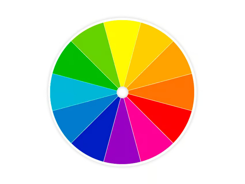
Now that we’ve explored color theory, let’s delve deeper into color psychology and how you can use it to your advantage. The color wheel is a helpful tool that organizes colors based on their appearance in the visible light spectrum. Warm colors are located on the left side of the wheel, while cool colors are on the right.
Warm colors are known for their boldness, vibrancy, and energy. They evoke feelings of enthusiasm, passion, and positivity, making them perfect for animation videos that truly grab attention.
Red, orange, and yellow are all warm colors that have unique meanings. Understanding the associations behind these colors can help you effectively communicate with your target audience.
For instance, using red in your marketing or explainer videos can create a sense of urgency, spurring viewers to take action. It’s no wonder that brands like McDonald’s and Coca-Cola utilize red to stimulate movement and excitement. In China, red is also associated with happiness and prosperity.
It’s important to note, however, that red can also convey violence, anger, and danger, so exercise caution when using it.
Snapchat breaks away from convention by embracing a vibrant yellow theme. This color embodies happiness, excitement, and creativity, making it extremely appealing to the younger generation.
Yellow is often used as a caution sign in many countries and can be associated with cowardice, so consider the connotations carefully.
Orange is a versatile color that represents enthusiasm, excitement, adventure, and vitality. It’s prominently featured in logos like Harley Davidson’s, Amazon’s, and Fanta’s. When using orange, consider the emotions you want to evoke in your video.
Remember, warm colors tend to make objects and design elements appear closer to the viewer. Adjusting the intensity of these colors can greatly impact their visual appeal, so aim for optimal levels in your color temperatures.
By harnessing the power of color temperatures, you can create compelling videos that resonate with your audience on a deep emotional level. So, take the time to choose the right colors and watch your videos come to life with vibrant energy and meaning.
Get Ready for Cool Colors:

Green, Blue, and Purple!
When it comes to cool colors, there’s nothing quite like green, blue, and purple. These shades give off a mellow and calming vibe that’s perfect for creating a soothing impression. And the best part? They effortlessly blend into the background in both images and videos.
Let’s start with green, the color of nature, health, growth, and relaxation. It’s no wonder that video marketers love using green to grab attention, simplify complex concepts, and guide viewers in making important decisions.
Big-name brands like Starbucks, British Petroleum, and Whole Foods embrace various shades of green to amplify their image. And it’s not just them – agricultural and energy companies also turn to green to convey a sense of health, organic products, and our connection to the environment.
Now, let’s talk about the regal and luxurious purple. It’s all about beauty, wisdom, creativity, and even royalty. While purple is often associated with products marketed to women, like jewelry and spas, times are changing. Forward-thinking companies like Twitch and Roku are embracing purple, opening the door for its use in non-feminine designs.
Last but not least, we have the timeless blue. Strength, trust, peace, intelligence, and communication – blue encompasses it all. Just take a look at the logos of tech giants like Facebook, Twitter, and LinkedIn, and you’ll see how prevalent blue is in the business world. It’s also a go-to choice for firms in accounting, legal, and professional services, as blue exudes productivity, security, reliability, and trust.
Remember, neutral colors like white, gray, brown, and black provide a clean, pure canvas. And while black brings strength, stability, and power, it’s crucial to weave a positive brand story around it to avoid any negative associations.
Now that you understand the psychology of color, it’s time to apply it to your marketing and advertising videos. Keep reading to discover how you can harness the power of colors to create engaging and captivating videos!
Choose Your Colors:
The Key to Telling Your Story
To create a winning video, start with a compelling script that resonates with your target audience. But don’t forget the importance of color combinations – they create emotional connections and keep viewers engaged until the very end.
Before diving into your script, research your audience to understand their preferences and what color temperature will best convey your message. And don’t be afraid to explore different story archetypes, especially if you’re selling a health improvement product. For example, depict how customer habits impact their daily lives, and then show how your product brings about a new lease of life.
Remember, you have a colorful palette at your disposal – use transitions and various colors throughout your story to keep things dynamic and captivating.
Evoke Emotions & Inspire Action
Your choice of colors can profoundly impact your audience’s emotions. If you’re aiming to create sales ads, go for colors like red, green, yellow, or orange – they’ll stand out and drive conversions. On the other hand, if you’re creating educational content, blue and green are excellent choices for grabbing attention, communicating complex topics, and keeping viewers engaged.
Make Your Videos Pop with Colors that Reflect Your Brand Image!
When it comes to creating videos, there’s no hard and fast rule about using your brand colors. However, incorporating them can have a powerful impact on your brand image, especially if you’re a startup or a growing business.
If your video is for sales, marketing, or brand promotion, it’s important to choose colors that complement your brand and resonate with your audience. Create color palettes that are memorable and connect with your customers.
Customers are more likely to trust and buy from brands that have a consistent and strong brand identity. Even if you don’t use your brand colors throughout the entire video, adding touches of them to key elements can make a significant difference.
Now that you have a better understanding of color theory, it’s time to let your creativity shine and bring your ideas to life. Think of each animation project as an opportunity to apply your color theory skills.
Don’t worry if you don’t have the budget to hire an animation expert. With Doodly, you can easily create professional whiteboard animation videos, even if you have zero tech or design skills. The best part is, Doodly gives you the artistic freedom to play around with different colored images that complement each other during the pre-production phase. You can also choose a background image and color tone that sets the mood and drives action.
If you prefer animated explainer videos, Toonly is another great option. Like Doodly, it’s created by Bryxen and allows you to adjust the intensity and saturation of different colors to create eye-catching videos. By using colors harmoniously in your projects, you can grab attention, engage your audience, and increase conversions.
Ready to learn more about creating videos with Toonly or Doodly? Check out our free Toonly tutorials or subscribe to our Doodly YouTube channel for all the tips and tricks you need.
Let your videos come to life with the power of color!