Email Marketing
The Complete Guide To High Converting Landing Pages
Discover the Ultimate Guide to Creating High Converting Landing Pages. Want to know the secret to growing your online business? It’s all about landing pages.
Unlike your website or social media channels, landing pages are specifically designed to get users to take action.
With a website, visitors can wander aimlessly. But with landing pages, you can guide them directly to where you want them to go.
Whether you want them to request more information, make a purchase, or book an appointment, landing pages are focused, straightforward, and get results.
In this guide, we’ll cover everything you need to know about creating high converting landing pages. From building and designing them to using them effectively in your online business.
So, what exactly is a landing page?
A landing page is a standalone page on your website or marketing funnel that’s solely designed to drive conversions.
These pages eliminate distractions and focus on enticing visitors to take action, whether it’s buying a product, subscribing to your email list, or requesting more information.
Using landing pages instead of sending people to your website or blog maximizes your conversions and reduces your marketing costs. It’s a win-win for your business.
Now, you may be wondering which landing page builder is the best.
Well, we firmly believe that ClickFunnels is the ultimate choice. Take a look at the chart below and see all the exclusive features we offer that other landing page builders can’t match…
With ClickFunnels, you can build not only landing pages but also websites, membership stores, ecommerce stores, online courses, and more.
Ready to try us out for free? Click below to start building your high converting landing pages with ClickFunnels now!
When it comes to types of landing pages, you have a few options.
Text-based landing pages are a popular choice among marketers and entrepreneurs who prefer simplicity. These pages load quickly, provide important information efficiently, and direct visitors to take action.
If you want to add some visual appeal to your text-based landing pages, you can include simple imagery that highlights your offer or showcases social proof. But the focus remains on the compelling copy.
Video landing pages are gaining popularity as high-quality video content becomes more accessible. Video makes it easier to convey your offer and allows others to vouch for its benefits.
Ultimately, the type of landing page you choose depends on your audience preferences and your capabilities. Determine what they want and deliver it in the most effective way.
Start creating your high converting landing pages today and watch your online business thrive.
Are Long or Short Pages Better?
When it comes to landing pages, the length can make a difference. It depends on what you’re offering and what your audience wants to see.
For example, if you’re just asking for an email in exchange for a free gift, you don’t need to write a novel to get conversions.
But if you’re selling a high-ticket item with a longer sales cycle, it’s important to cover all the benefits, objections, and questions. In that case, longer landing pages work better.
However, as a general rule, shorter pages are always preferred.
So if you’re selling a $10,000 offer and your copy is 5,000 words long, it’s a good idea to make it shorter, simpler, and straight to the point.
Likewise, if you’re only asking for an email and your copy is 500 words long, consider if all those extra words are necessary.
Remember, landing pages should provide a quick and effortless solution to your audience’s problem, for their sake and yours.
Unlock the Benefits of Landing Pages
In addition to higher conversion rates, landing pages offer several other advantages for your business.
Simplicity
If your goal is to gain new subscribers or customers, simplicity is key. Landing pages simplify the customer journey and provide a clear path to their desired destination.
They are easy to deploy and test, saving you the hassle of maintaining complex websites or blogs.
First Impression
You only have a short amount of time to make a lasting impression when someone visits your site. Landing pages can be quickly deployed and designed to look great, giving you the best chance at a positive first impression.
By focusing on a specific goal and providing a seamless experience, you ensure that your visitors remember you as the person who can help them, rather than someone who made them navigate a clunky website.
Increased Conversions
It’s no secret: landing pages convert at significantly higher rates compared to websites and blogs.
Capturing emails or making sales is much easier with well-designed landing pages than with blog posts or complex websites.
Build Your Landing Pages with ClickFunnels NOW!
Essential Elements for Effective Landing Pages
To maximize the effectiveness of your landing pages, there are a few key elements you should include.
Callout
Grab your visitors’ attention right away with a callout that clearly states who the page is for. Make it easy for them to know they’re in the right place.
Headline
Your headline is critical in capturing your audience’s interest. It should be specific, intriguing, and stop them in their tracks. Keep it relevant to the content on the page and focus on the value they’ll receive. A compelling headline can make all the difference in your conversions.
Don’t Miss Out! Start Building Your High Converting Landing Pages with ClickFunnels Today!
Subheadline: Taking Your Headline to the Next Level
Think of your subheadline as an opportunity to expand on your headline’s promises. It’s a chance to spark more curiosity and keep your readers engaged. To craft compelling subheadlines, start by identifying the “big domino” – the key element that will set off a chain reaction. Once you know this, writing effective subheadlines becomes a breeze. Remember, your subheadline, headline, and callout are the first elements you should test and optimize as you drive traffic to your landing page.
Example of a Powerful Subheadline from the Secrets Trilogy Funnel:
Discover a bonus workbook when you purchase the Expert Secrets trilogy – adding even more value to your reading experience.
Bridge the Gap between Where They Are and Where They Want to Be
Understand where your visitors currently stand and where they aspire to be – this is the gap you need to bridge. Show them that you comprehend their desires and expectations. For instance, if they want to lose weight, they might feel self-conscious in family photos and be yearning for a solution to help them shed those extra pounds. Build a connection between their present situation and their desired outcome through your copywriting, and you’ll capture and hold their attention.
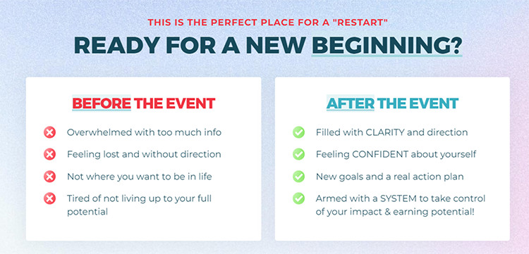
Example of an Effective Bridge from the Own Your Future Challenge Funnel:
Picture yourself feeling confident and happy as you achieve your weight loss goals. Our program is designed to give you the support and tools you need to regain your confidence and transform your life.
Offer a Transformation, Not Just a Product
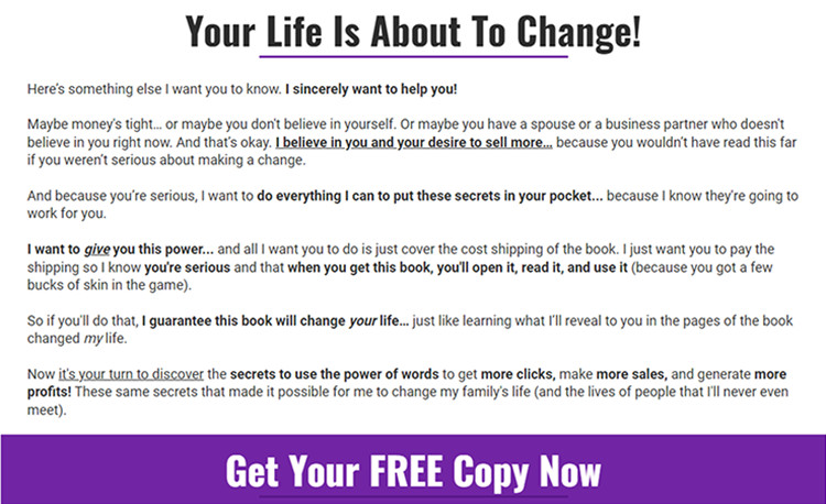
Your offer goes beyond simply giving customers something tangible – it’s about the transformation they will experience or the problems you’ll help them solve. While your offer may include specific deliverables like eBooks or videos, what people are truly buying is the journey from where they are now to where they want to be. Your offer is the final piece that completes the bridge between these two points.
Check out the Compelling Offer Stack from the Copywriting Secrets Funnel:
Turn Features into Benefits with Bullet Points
Bullet points are essential in showcasing the benefits of your offer and creating curiosity. While the features represent what customers receive, it’s the benefits that truly resonate with their needs and desires. Short and straightforward bullet points should bridge the gap between your features and the transformative benefits they bring to the table.
Share Social Proof to Boost Conversion Rates
Enhance the legitimacy of your brand and build trust with your audience by incorporating social proof and testimonials strategically on your landing page. This can make a significant difference, motivating visitors to take action instead of leaving. However, make sure your social proof is a seamless part of the conversation and not an afterthought. It should serve to convince and guide potential customers towards making a purchasing decision.
Include a Clear Call-to-Action (CTA)
Never assume that your audience knows what to do next. After capturing their attention and guiding them through your page, be explicit about the next steps they should take and what they can expect. Whether it’s a simple “click here” or a more compelling CTA with a clear benefit, leave no room for confusion about how to proceed.
Start optimizing your landing pages with these actionable tips today!
(Note: Remember to click here to learn more about the “big domino” concept and its role in crafting irresistible subheadlines)
4 Simple Steps to Build High Converting Landing Pages
To create effective landing pages, it’s important to follow a specific order of operations. Let’s break it down.
Step #1: Research
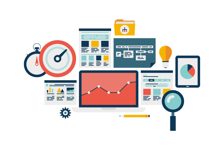
Research is the key to understanding your audience and their needs. Take the time to map out their customer journey, identify roadblocks, and figure out how you can help them overcome those obstacles. By truly understanding your audience, you’ll be able to build landing pages that specifically target their needs.
Step #2: Copywriting
The words you use on your landing pages are critical to driving conversions. By doing thorough research on your audience, you’ll have an easier time crafting persuasive copy. Remember, your copy will evolve over time, so be open to feedback from your subscribers and customers.
Step #3: Design
Design plays a crucial role in the success of your landing pages. Your design should make it easy for visitors to read your copy and engage with your visuals. Whether you go for a simple or more complex design, the key is to appeal to your target audience.
Step #4: Conversion Rates
Once you’ve collected data from your landing page traffic, it’s time to optimize. Split testing different versions of your landing page can help you increase conversions. You can either test one element at a time or try a completely different approach. Use the feedback from your audience to make adjustments and improve your conversion rates.
Are you looking to boost conversions on your landing pages? We’ve got you covered with these 11 quick tips!
Tip #1: Match your message to your ads.
This one is crucial. When it comes to driving traffic to your landing page, you only have one chance to convert them. While you can use retargeting ads to reach visitors again, it’s important to ensure that the ads you use align with the message on your page.
Think about it this way – if you’re running an ad targeting people who want to make money online, but then send them to a landing page for a product like ClickFunnels, they’ll be left scratching their heads. Instead, create an ad that matches the content on your landing page, showing them how to make money online with ClickFunnels. Trust us, it’ll work like a charm!
Tip #2: Work above the fold.
You know that prime real estate on the front page of a newspaper? Well, the same concept applies to the digital world. The space that’s visible without scrolling is precious, so make sure to utilize it effectively. Keep your headline, subheadline, bullet points, and call to action front and center. This will ensure that visitors understand they’re in the right place and know exactly how to take action.
Tip #3: Direct their eyes.
While it’s unlikely that you can fit everything above the fold, you can still guide your visitors’ attention as they scroll. Use visual cues like bright red arrows or contrasting colors to direct their eyes to important elements on the page. If you have the resources, you can even employ heat mapping and tracking services to understand where people are looking and clicking. The key is to make sure what you want them to see stands out.
Tip #4: Show your offer in action.
To encourage visitors to take action, show them how your offer can benefit them. If you’re selling physical products, showcase them in various use cases. For digital products or services, get creative! Use Funnel Images to simulate how your digital product would look in action. Overlay a video screenshot onto an image of a device, so visitors can visualize the experience they’ll have with your offer. Remember, visuals are powerful.
Tip #5: Eliminate distractions.
When it comes to a high-converting landing page, focus is key. Avoid giving visitors any opportunity to wander off or get sidetracked. Remove links to other websites or navigation links that lead to different pages on your site. Your landing page should have one clear action for visitors to take – either accept your offer or leave the page. By keeping distractions to a minimum, you’ll increase your conversion rate.
Tip #6: Include social proof.
Social proof can be a game-changer when it comes to convincing hesitant visitors to convert. However, it’s crucial to use real social proof. Avoid fake testimonials or fabricated screenshots – today’s audience can sniff those out from a mile away. Instead, showcase genuine testimonials and social proof from real customers. Encourage satisfied customers to leave reviews online, especially if you’re offering a high-ticket item. Building trust is essential.
Tip #7: Use clear and simple copy
Less is more when it comes to enticing people to take your offer. Keep it simple and concise, around 50 to 100 words including a headline, subheadline, bullet points, and a call to action. Check out this example from Traffic Secrets Masterclass, where less than 50 words converted incredibly well.
Tip #8: Make sure your landing page loads fast
In today’s fast-paced internet age, a slow-loading page can lead to frustration and missed opportunities. If your page takes more than 3 seconds to load, you risk losing potential customers and wasting advertising dollars. Keep your page light and avoid unnecessary elements that slow down load speed. Use a tool to check your load speed, aiming for under 2 seconds.
Tip #9: Design for different devices
A landing page designed for mobile may not function properly on desktop or tablets. With software like ClickFunnels 2.0, you can easily design and preview your landing page on different devices before publishing. Ensure a seamless experience for users on all devices to improve conversion rates.
Tip #10: Test your pages
Just because your page converts initially doesn’t mean you’re done. Continuously test and optimize your copy, hooks, headlines, and call to action based on subscriber feedback and customer behavior. Use software to track changes and automate split tests to find the winning formula and improve your conversions.
Tip #11: Consider using templates
Unless you’re a seasoned pro, using templates can save you time, money, and headaches. Templates from the ClickFunnels marketplace are proven to convert and can be customized to fit your offer. Save time and let experts handle design and web development so you can focus on delivering a top-notch offer and serving your customers.
In conclusion, follow these tips to create high converting landing pages, and watch your conversions soar.
>>>Join The One Funnel Away Challenge<<<


