Reviews
OptinMonster Reviews: The Good, the Bad and the Ugly
OptinMonster Reviews: The Good, the Bad and the Ugly. Email marketing continues to be the most reliable channel to connect with your readers and customers. It’s that stable foundation, you can depend on to bring you consistent traffic and income at the push of a button.
Even if you are not doing email marketing now, it is still important to collect email addresses of visitors on your site so you can build up an audience to be ready when you need it.
That’s why you see lead generation opt-in forms on most of the sites you visit. It’s because they work.
There are a lot of services out there that can help you add lead capture forms to your site. Thrive Leads and LeadPages are two of my favorites.
But in today’s review, I’m going to look at another popular lead generation software tool called OptinMonster to see how it compares.
Why Do I Need This?
Before investing in any of these tools, you need to have an email marketing strategy.
Just slapping a sidebar opt-in form that says “Subscribe here for updates” is not going to work. At least, not very fast.
Instead, make sure you need to craft a targeted, well-crafted lead magnet that will provide value to your readers and will incentivize them to subscribe. Once you have that in place, then you will be ready to invest in a tool like OptinMonster.
What is OptinMonster?
OptinMonster is a cloud-based lead generation software which launched in 2013 and was created by Syed Balkhi and Thomas Griffen. So at this point in time, it is now a very mature product. Using this tool makes it easy for you to build beautiful lead capture forms without being or hiring a developer.
OptinMonster is an all in one list building software and supports all the popular opt-in form types.

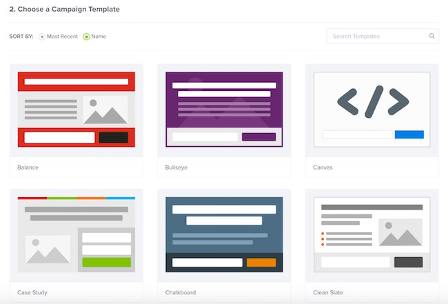
Each opt-in form type has its own set of templates, which it calls themes that you can use to create different looking forms.
At the time of this review, there are a total of 94 opt-in themes.
The themes are all really professional looking, and I really would have no problems using any of them on this site.
However, browsing through the themes highlighted one of my first annoyances with the service.
Before deciding on what theme to use for my form, I always like to browse around at several different themes before I choose. But OptinMonster for some reason presents their themes using these abstract previews.
Take Balance theme for example. The preview looks like this but the actual form looks like this.
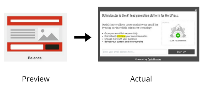
I’m really unclear why they wouldn’t just use an actual screenshot of the preview. It would save a ton of time trying to find the one you want, and with much fewer clicks.
Visual Editor
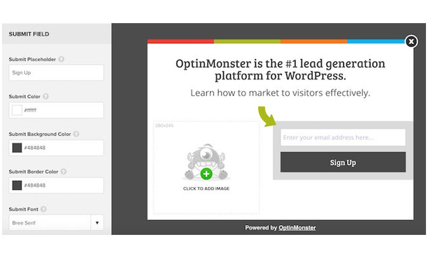
OptinMonster comes with a very basic point-and-click form editor. You can select different elements on the form to edit its supported properties.
For example, clicking on the ‘Submit’ button of your form allows you to edit the text, font, foreground, background and border colors. It’s all fairly basic what you can customize.
There is no ability to re-arrange, add or even delete elements. So if you pick a theme that contains bullet points, but you don’t want them, there’s no way to get rid of them.
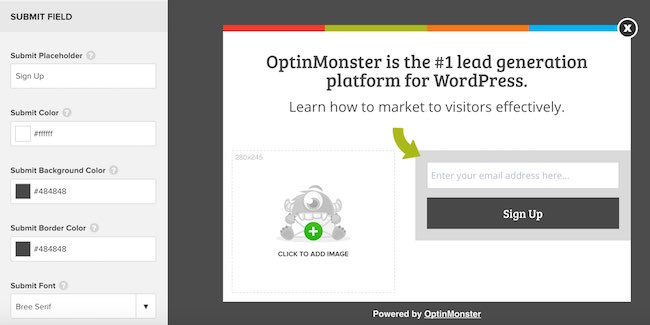
Compared with the drag and drop niceness of the new LeadPages editor, for example, the OptinMonster editor is quite limited in comparison.
However, there are certainly marketers who don’t care as much about design, and just want to use something that they can customize quickly to fit their own messaging.
If this describes you, then you will like OptinMonster for its simplicity and speed in getting up and running fast.
If you know CSS, each theme also includes its own CSS editor. This allows you to customize elements of your theme that are not made available to you through the default editor.
However, you will need to know how to use your web browser’s debugging functions to find the ids and classes of the various elements to know what CSS selectors to use.
OptinMonster also includes a special Canvas theme. Essentially it’s a completely blank theme where you can use the HTML and CSS editor and build an opt-in theme from scratch.
If you know how to code or want to hire someone to code your opt-in for you then this option is really nice. Although, I didn’t like the fact that the HTML and CSS editors are not real time. This means you have to close the popup editor to see your changes which is not very convenient.
Targeting Options
OptinMonster has a very powerful targeting system that allows you to pick which pages your opt-in will appear and which of your visitors will see it.
OptinMonster uses the concept of rule sets, which are a set of conditions grouped together.
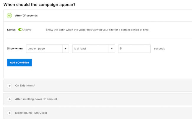
There’s quite a bit of flexibility in when your opt-in should appear. You can configure your opt-in to show:
- After ‘X’ amount of seconds
- On Exit Intent: When a visitor is about to leave
- After scrolling down ‘X’ amount on a page
- On clicking a MonsterLink: basically a 2 step opt-in
- During a specific date/time
They can each be used by themselves or combined together. So, for example, you could have your opt-in show when a user scrolls down 50% down a page during Black Friday.
You can also configure where your opt-in will show. Here you can say you want your opt-in to show on specific page slugs, on specific devices (mobile or desktop) and quite a few more.
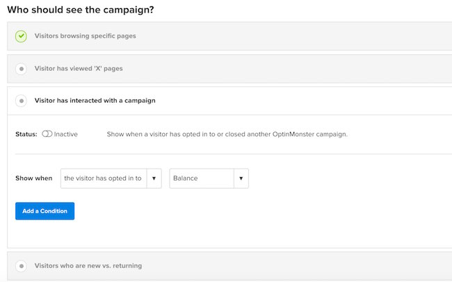
There are a lot of options here, which is great for power users. But with all the combinations you can create, I found that sometimes all this choice became a little overwhelming.
Typically, I would recommend sticking to just 1 or 2 conditions at most.
Reporting and Split Testing
Knowing how your opt-in forms are performing is an essential aspect of any lead generation software. OptinMonster provides basic reporting capabilities where you can see your visitors, conversions and conversion rates over specified time periods.
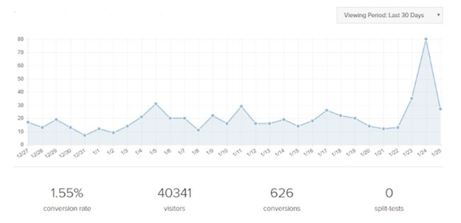
OptinMonster made one major design decision with their reporting that I’m not sure I agree with. To get any of your stats, you HAVE to integrate with Google Analytics. I know GA is free and hands down the most popular analytics service out there. But not everyone uses or is willing to use Google Analytics (like me). I just prefer a simpler alternative like
But not everyone uses or is willing to use Google Analytics (like me). I just prefer a simpler, less intrusive alternative like Clicky instead.
Anyway, unless I decide to add Google Analytics to my site, I cannot see my stats using OptinMonster! That seems kind of lame and I’m unclear why they aren’t able to calculate their stats themselves.
If LeadPages can calculate your opt-in stats, why can’t Optin Monster?
Split Testing
Split testing is the best way to ensure you are growing your list as fast as possible. By testing different elements on your opt-in forms, like your headlines, your bullets, or your images, you can really improve your conversion rates.
Creating split tests in OptinMonster is fairly simple. On the dashboard, you will see a list of all your campaigns. Go to the campaign you want to split test and under ‘More Options’, you will see the option to create an A/B split test.
From there you can name your split test and enter any notes, which is very handy to keep track of what you are actually split testing. It will then take you to the editor where you can make the changes you want.
Once this is complete, your split test will appear in the dashboard along with your original campaign and you can see how well they perform together.
OptinMonster Pricing
OptinMonster is a web application, so it uses a typical monthly payment structure. They offer 3 different types of plans: Basic ($19/mo), Plus ($29/mo), and Pro ($39/mo).
The basic plan is pretty limited. You can only create Lightbox popups and it can only be used on one site. The Pro plan is where you unlock all of OptinMonster’s functionality. Plus it can be used on unlimited sites.
OptinMonster does offer the occasional 10% discount coupon directly on the site. You can also save money by paying annually where you can save an additional 25% off each plan.
OptinMonster vs the competition
OptinMonster is a mature product, and it is a very popular tool for collecting emails. But how does it compare against the two tools we use on SmartBusinessTrends to collect emails: LeadPages and Thrive Leads.
OptinMonster vs LeadPages
You can’t really make an apples to apple comparison between Optinmonster and LeadPages. LeadPages can do a lot of stuff that OptinMonster can’t do like create landing pages, while OptinMonster has a wider variety of lead capture options.
But they do both offer ways to create email opt-in lightboxes, so let’s see how they compare.
In terms of pre-built templates, Optinmonster wins by quite a bit. They offer a wide variety of really nice looking templates, while LeadPages only has one basic Leadbox template.
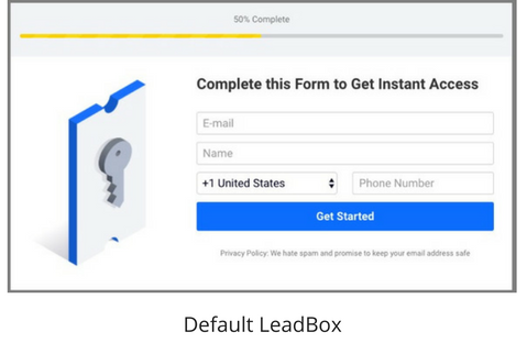
However, LeadPages does have its own drag and drop editor, so you can now customize your LeadBox in much more ways than you could do before. Contrast this to OptinMonster’s editor which doesn’t allow you to move elements around at all.
The one advantage that Optinmonster has is that you can fully customize the design of your popup using CSS. If you know how to code CSS then this is a definite plus.
Both OptinMonster and LeadPages give your similar capabilities for creating timed popups, 2 step opt-ins, and showing on exit intent. However, OptinMonster gives you more control of what pages you want your popup to appear.
However, I found it more complicated to use and I feel LeadBoxes are easier to publish and get up and running on my site.
Price-wise, both have monthly payment plans. But LeadPages is, of course, more expensive since LeadBoxes are only a small aspect of what it can do.
Overall, if you are already using LeadPages, then I don’t recommend using OptinMonster in addition to it. It doesn’t provide enough value to justify the extra cost. But, if you are looking specifically to add a lead capture service, then OptinMonster might be a viable choice.
OptinMonster vs Thrive Leads
Here at SmartBusinessTrends, Thrive Leads is our main software of choice for creating email opt-in forms. So how does Optinmonster compare?
Both products support all the same opt-in form types, from lightboxes to full-screen welcome mats and floating bars. Thrive Leads has a lot more templates available, but I think both provide a good selection of templates.
Which looks better? I would say they are similar in quality, and it depends on the style you are looking for. Thrive Theme templates have a more flat, subdued look, while I would say OptinMonster has a more bright, style.
If you need to do any customizations to your form, Thrive Leads has OptinMonster beat with its fully drag and drop editor. With Thrive Leads you can position elements wherever you want them, which allows you to design a wider variety of opt-in-forms.
Both Thrive Leads and Optinmonster are very comparable in what display and targeting options they offer.
Thrive Leads really sets itself apart with its split testing and reporting capabilities. I use their content marketing report all the time as it tells me which pages on my site convert the best.
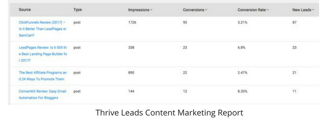
And it shows me the statistical significance for my running split tests and has the ability to automatically pick a winner which are 2 features I love and use a lot.
Plus, I prefer Thrive’s pricing structure as there is no monthly payment. To use on 15 sites, it’s just a $147 one time fee. That’s basically 4 months of Optinmonster. And if you don’t need that many sites, they offer a couple of lower price points as well.
If you’re collecting emails using a service like this, you could be using it for years. That cost really adds up when you’re paying a monthly fee.
Final Thoughts
If you want to be serious about collecting emails on your website then it’s essential to invest in a solid lead generation tool.
OptinMonster is definitely worth looking at as it has several features that make building your list easier.
But it’s hampered by some strange design decisions, most notably requiring Google Analytics to see your stats.
It also doesn’t have the advanced split testing and reporting features that other tools have which I’ve found to be essential for identifying and maximizing your conversion rates.
That’s why I’ll still be using Thrive Leads on this site to help me grow my email list.
OptinMonster Pros
- Well designed opt-in templates.
- Easy to use the form editor to make quick and simple customizations.
- Integrates with all popular ESPs including ActiveCampaign, Drip, ConvertKit, and Mailchimp.
OptinMonster Cons
- Limited editor means limits flexibility in customizing your opt-in forms.
- Requires Google Analytics to see your stats.
- Need to pay monthly to maintain your forms and data.
>>>Join The One Funnel Away Challenge<<<


