Email Marketing
How To Easily Create A Landing Page With Email Sign Up Forms
Looking to grow your email list? The best way is to lead your visitors directly to a landing page with an email sign up form.
But how do you create that perfect landing page for your business?
That’s exactly what we’ll cover today…
What Is a Landing Page?
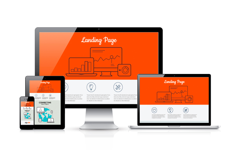
Before we dive in, let’s make sure we’re all on the same page when it comes to the definition of a “landing page“:
A landing page is a web page with a specific goal in mind.
In theory, that goal could be anything, but in practice, most landing pages fall into two categories:
Lead generation landing pages, designed to obtain visitor contact details.
Sales landing pages, designed to convince visitors to purchase a product or service.
Other conversion goals, such as social media sharing or customer reviews, are rare.
Keep in mind, while “landing page” encompasses all web pages with a single conversion goal, marketers usually use it to refer specifically to lead generation landing pages.
So what exactly is an email sign up landing page?
The most popular type of lead generation landing page is the email sign up landing page. It’s where you ask visitors to provide their name and email address, or just their email address.
Typically, email sign up landing pages offer a lead magnet in exchange for the visitor’s email address. This is the most effective way to generate leads.
While a lead magnet isn’t mandatory, it’s much harder to convince people to give you their email without one.
Remember, not all web pages with an email sign up form are considered email sign up landing pages. Email sign up forms can be displayed on various pages like the homepage or the About page, but they are not dedicated landing pages.
An email sign up landing page is a standalone web page with the sole purpose of capturing email addresses from your ideal customers.
For example:
Check out one of our email sign up landing pages:
What Is an Email Sign Up Landing Page?
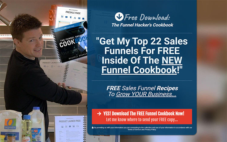
Get “The Funnel Hacker’s Cookbook” for FREE!
Notice how there’s nothing distracting the potential customer from clicking the call-to-action button and signing up for our email list?
That’s what we mean by landing pages with a specific conversion goal!
Now, here’s how to create an email sign up landing page for your business:
#1. Create an Irresistible Lead Magnet
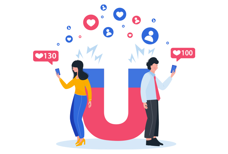
A lead magnet is a valuable freebie that you offer to potential customers in exchange for their email address.
It can be anything that they can download or access online, like a report, ebook, case study, video class, or webinar.
Your lead magnet should provide a solution to a problem your potential customer is struggling with. Ideally, this problem should be related to your frontend offer.
Don’t worry if you don’t have a sales funnel in place yet. You can create an email sign up landing page with a lead magnet even if you don’t have anything to sell right now!
So there you have it! Follow these steps to create an email sign up landing page that will help you grow your email list and capture leads effectively.
#2. Choose the Right Landing Page Software
Gone are the days of coding landing pages from scratch. Why waste time when landing page software can generate a page for you in seconds? But with so many options out there, how do you choose the right one for your business?
Here’s what you need to create email sign up landing pages:
A library of landing page templates
A visual editor for customization
Email marketing functionality for collecting email addresses and sending automated sequences and broadcast emails
While most landing page builders have templates and editors, not all of them include email marketing functionality. You might need a separate app for that. Consider your overall business workflow and see if you can find software that covers multiple needs.
For example, ClickFunnels 2.0 offers a library of high-converting templates, a visual funnel and page builder, email marketing functionality, e-commerce features, and more. With our software, you have everything you need to build a successful online business!
Start your free trial now.
#3. Use a Proven Landing Page Template
Designing a landing page from scratch may seem tempting, but why reinvent the wheel when we already know what works? Online marketers have spent years optimizing landing pages, so it’s best to follow established best practices.
ClickFunnels 2.0 has a template library with high-converting options for all common use cases. Why waste time when you can use proven templates?
Start your free trial now.
#4. Have a Headline That Conveys the Value of Your Free Offer
Your landing page’s copy is crucial for persuasion. As David Ogilvy once said, the headline is the most important part of your message. In today’s distracting online environment, you only have seconds to grab attention.
To write a compelling headline, focus on the main benefit of your free offer. How will it improve the potential customer’s life?
Start crafting your attention-grabbing headline now!
#5. Grab Attention with a Subheadline that Shines a Light on Your Free Offer
Your headline is important for capturing attention, but don’t underestimate the power of a subheadline. While the headline grabs the reader, the subheadline provides more information about your offer.
Here’s the secret: once you’ve hooked them with the headline, they’re likely to read the subheadline too. It’s human nature. Use this opportunity to quickly convey the key details of your free offer.
Take a look at a great example from Nick Stephenson’s ” $0 to $1k Per Month” landing page. If you’re a writer looking to earn money as an author, this headline and subheadline will pique your curiosity and get your attention.
But here’s the clever part – the headline is both aspirational and realistic. This landing page is part of Nick’s sales funnel, where he aims to build trust and sell his “Your First 10k Readers” course.
The key to building trust is making a promise and delivering on it. By going through the free ” $0 to $1k Per Month” course, implementing the strategies, and reaching that $1,000 per month milestone, you’ll naturally be interested in the paid course. Makes sense, right?
So skip the hype and make promises you can keep. Provide valuable content that your potential customers can implement.
#6. Boost Trust with Social Proof
When people are uncertain, they look to others for guidance. This is called social proof. In the business world, it means that when potential customers are unsure about trusting you, they seek indications that others trust you.
You can leverage this psychological principle to your advantage by providing social proof.
There are two types of social proof:
Direct social proof: This relates to the offer itself and typically comes in the form of testimonials.
Indirect social proof: This relates to you or your company and can include education, credentials, accomplishments, sales figures, previous clients, media features, and more.
Not all social proof is created equal – the more credibility it has, the greater impact it will have on your potential customers.
For example, Nick Stephenson showcases testimonials on his ” $0 to $1k Per Month” email sign up landing page, including one from bestselling author Joanna Penn. This testimonial boosts Nick’s credibility because Joanna is a successful author and has benefitted from Nick’s advice in her own marketing journey.
Even if you’re just starting out, you can apply the same principles to testimonials: make sure they come from real people, describe the situation they were in, and provide concrete results.
Avoid testimonials that look fake, as they will damage your credibility. For instance, a testimonial like “This product is great!! Jane, USA” won’t do you any favors.
We highly recommend seeking out social proof in the form of credentials, media mentions, speaking engagements, and more. Even a little bit of social proof from credible sources can work wonders for your conversion rate!
#7. Get the most out of your landing page copy with awesome images.
When it comes to using images on your landing page, there are two main approaches:
Use aspirational images to evoke emotions. For example, if you’re offering a course on writing, you can use an image of a typewriter to remind your potential customers of their dream of becoming successful writers.
Boost your credibility by using photos of yourself or industry events. If you have a strong personal brand, your own photos can add trust and credibility to your landing page. Alternatively, you can showcase yourself at industry events or even with well-known thought leaders in your niche (after obtaining their permission, of course).
Looking for beautiful images for your landing page? Check out free stock photo websites like Unsplash.
Now, let’s talk about optimizing your email sign up landing page with A/B testing.
You can’t just guess whether your landing page will convert or not. That’s why we recommend creating your landing page quickly following the guidelines in this article, and then drive traffic to it with paid ads. Once you have enough data to establish a baseline conversion rate, it’s time for A/B testing, also known as split testing:
- Create two variants of your landing page, A and B. The only difference between them should be the element you want to test (e.g., the headline).
- Split your traffic in half and direct half of it to variant A and the other half to variant B.
- Let the experiment run until it reaches statistical significance, then evaluate the results and keep the winning variant.
Using software like ClickFunnels 2.0 makes A/B testing easier, as it handles the mathematical heavy lifting for you. However, it’s always good to learn about A/B testing statistics to understand the principles, avoid common mistakes, and become better at experiment design and data interpretation.
Remember, not all A/B tests will yield meaningful results, especially once you’ve optimized your landing page. But even small increases in conversion rate can have a significant impact on your bottom line. So make A/B testing a habit and watch your profits soar – 2x, 5x, or even 10x!
Having trouble getting your email sign up landing page to convert? Don’t worry, we’ve got you covered!
If you’ve followed all the advice in this article and you’re still not seeing results, there could be a few potential problems to address:
Your offer might not be valuable enough. Consider improving your current offer or coming up with something better.
Your landing page might not effectively convey the value of your offer. Work on improving your landing page copy.
Your traffic might not be the right audience for your offer. Improve your targeting in your marketing campaigns, especially if you’re using paid advertising.
To troubleshoot these issues, we recommend starting with the traffic, then the landing page, and finally the offer.
But before you give up completely, consider using ClickFunnels 2.0 to build landing pages that actually convert. With our platform, you’ll have access to proven templates, a visual editor for customization, and A/B testing to optimize your pages.
The best part? We offer a free trial, so you can try it out without any risk. Get started today and see the difference it can make for your landing pages!
>>>Join The One Funnel Away Challenge<<<


