Guides
8 Landing Page Strategies That Increase Conversion Rates
Don’t let your hard-earned website visitors slip away! When people land on your pages, you want to make sure they stick around and become subscribers or customers. But if your landing page doesn’t meet their expectations or performs poorly, you’ll struggle to convert that traffic into new customers. That’s why it’s crucial to hit the mark and deliver exactly what your market is looking for.
In this guide, we’ll share the best landing page strategies to help you convert your hard-earned attention into actual results. By implementing these strategies on your landing pages, you’ll skyrocket your conversion rates and reduce bounce rates. The end result? Effective marketing campaigns and predictable growth for your business.
Here’s how to do it:
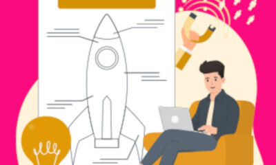
Tip #1: Hook them with Benefit-Driven Headlines: Increase Conversion Rates
Start strong with a headline that directly appeals to your visitors. Use benefit-driven headlines that highlight the value they’ll gain from reading your page. For example, if you offer weight-loss tips for brides-to-be, a headline like “How to Lose Weight in 10 Days So You Look AMAZING in Your Wedding Photos” will instantly capture their attention. Remember, focus on the biggest benefit your readers will get to keep them engaged.
Now that you have an idea of how to create compelling headlines, let’s dive into more examples to help you understand the power of benefit-driven headlines and why they work so effectively.
By following these strategies, you’ll not only captivate your audience but also provide them with a clear reason to keep reading and take action. But remember, optimizing your landing pages for high conversion rates requires a well-rounded approach that incorporates various elements. In the next sections, we’ll cover more strategies to help you tell your audience why they should choose you and what they’ll gain from it.
Tip #2: Focus on One Avatar, One Offer
But wait, there’s more!
To write attention-grabbing headlines that resonate with your audience, you need to understand what they really want from you.
The secret? Drill down and focus on one specific avatar at a time.
Here’s the thing: it doesn’t make sense to create a weight loss offer for brides-to-be and market it to men over 50 on the same page.
Many entrepreneurs and marketers make the mistake of trying to capture as many different avatars as possible, introducing multiple offers and options to try and appeal to everyone who’s paying attention.
But here’s the truth: targeting too many avatars and offering too many options leads to confusion. And a confused mind takes no action.
To make your landing pages super effective, keep them laser-focused on one avatar and one offer at a time.
I know it may seem counterintuitive. You might think that you’re narrowing down your audience too much. But here’s what happens when you do this right: you speak directly to that perfect prospect, the one who can’t resist saying yes.
So while your message might not reach the largest audience, it will reach and convert more of the right people.
For example, if your target is brides-to-be who want to lose weight before their wedding photos, your messaging will be tailored specifically to them.
When you tighten up your page’s messaging, everything becomes more relevant to that one perfect prospect. Your images, headlines, subheadlines, bullet points, calls to action – they’ll all address exactly what your audience needs to see from you.
And that relevance is the key to boosting your conversion rates.
Tip #3: Grab Attention Above the Fold: Increase Conversion Rates
The next strategy is all about making the most of the prime real estate that visitors see as soon as they land on your page.
We call it “above the fold.”
Think about a physical newspaper. When you see it in a machine or on a stand, you can only see what’s on the top half of the front page, right? You have to unfold the paper to see the rest.
That top half of the front page is the most valuable real estate on the newspaper. And the same goes for your landing pages.
In the digital world, “above the fold” refers to the space that’s visible before visitors have to start scrolling down your page.
With attention spans getting shorter by the day, it’s crucial to make the most of this space. You need to capture people’s attention, show them the benefits of reading further, and give them a reason to click your call to action right away.
Take a look at this example that uses the above-the-fold space effectively:
Now, compare it to this example:
In this second example, there’s no call to action above the fold. You have to scroll down to see the offer.
While this may work in some cases, it’s likely hurting conversion rates because users have to work to find the CTA.
To improve conversion rates, consider eliminating irrelevant clutter or moving the CTA above the image so visitors can see it without scrolling.
Now, this isn’t always a hard rule. If you have a complex offer or need more space to explain the features and benefits, you may need to use the above-the-fold space differently.
The key is to test different approaches to find what works best for your pages.
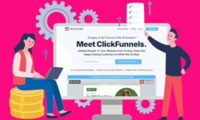
Luckily, ClickFunnels offers an A/B split testing feature to help you optimize your landing page for maximum results.
So, are you ready to boost your landing page conversion rates? Let’s dive in!
Tip #4: Get Social Proof Right for Maximum Impact!
When visitors land on your page, it’s crucial to show them that your offer can solve their problem. And one of the most effective ways to do this is by incorporating the right type of social proof. By showcasing how your product or service has helped others just like them, you can build trust and credibility.
But here’s the thing: you don’t want to overwhelm your audience with an endless list of testimonials. Instead, carefully select a few key reviews that specifically address the benefits highlighted on your page. This targeted approach will have a much greater impact on your conversion rates.
Check out these examples:
Instead of bombarding the page with numerous testimonials, focus on showcasing three reviews that highlight features your audience will love, like high-quality tea tins, a variety of delicious flavors, and a tea sampler to help them find their favorites.
Use a combination of text and video to show how your offer can benefit your audience, just like in this great example.
Establish authority by featuring a single testimonial from a recognized celebrity.
Further enhance credibility by injecting three more reviews from respected authority sources.
Remember, the key is quality over quantity. Each testimonial and review should be hand-picked to strategically move the conversation forward on your page. And consider incorporating these four main types of social proof for maximum impact: customer reviews, celebrity testimonials, authority features, and user-generated content.
Here’s an example that showcases user-generated content submitted by customers, allowing potential customers to see firsthand how your product or service can benefit them.
When it comes to social proof, less is more. Instead of overwhelming your audience, choose a select few testimonials and reviews that are highly relevant to specific sections of your page.
Ready to create high-converting landing pages? Start building with ClickFunnels now!
Tip #5: Keep Distractions at Bay: Increase Conversion Rates
To make your landing pages even more effective, it’s important to minimize distractions and limit ways visitors can leave the page. Your goal is to guide them seamlessly to your call to action.
Avoid including navigational menus on your landing page, as they can lead visitors astray. Instead, use that space strategically to create a sense of scarcity or urgency. Highlight time-limited offers or promotions that prompt immediate action.
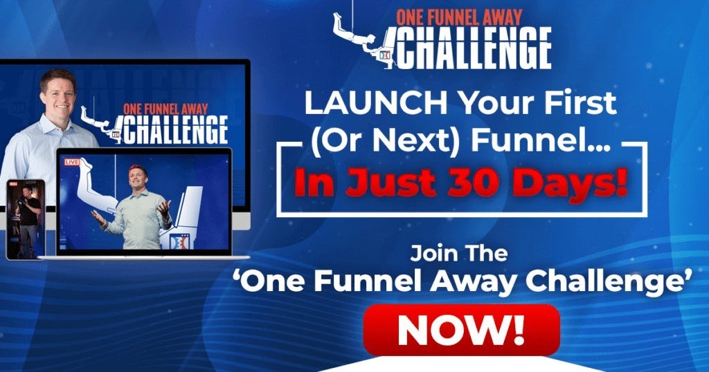
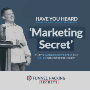
Take a look at this example from Your First Funnel Challenge. By removing the standard navigational menu, the landing page effectively utilizes that space to create a sense of urgency, showcasing the time remaining until the next challenge launches. This encourages visitors to take action and engage with the call to action, which is prominently displayed above the fold.
Notice how the landing page also makes excellent use of the space above the fold, using a hero image to establish authority and credibility. Many visitors will recognize well-known figures like Russell Brunson and Damon Johns, further reinforcing trust in the offer.
By eliminating distractions and optimizing the space on your landing page, you can create a focused and compelling user experience that drives conversions.
Start implementing these strategies to boost your landing page conversions today!
Imagine having a landing page that addresses all the objections your visitors might have, keeps their focus on your content, and convinces them to take action. Sounds amazing, right?
Well, we’ve got some tips for you.
First, place your enticing call-to-action (CTA) above the fold, so your visitors see it right away and are motivated to join your free challenge. Don’t let them miss out!
Tip #6: Get Recognized for Success: Increase Conversion Rates
Do you want to establish a lasting connection with your audience? Then it’s time to focus on recognizable branding. While it may take time to fully develop, building brand recognition is a crucial strategy that you need to start implementing now.
Consistency is key when it comes to branding. From your landing pages to your ads, website, and everything in between, make sure all your touchpoints reflect your brand. By doing so, you’ll leave a lasting positive impression on potential customers. Even if they don’t make a purchase immediately, they’ll associate your offers with the positive feelings they have towards your brand.
Building a strong brand involves the following:
1. Logo Consistency: Ensure that your logo matches across all digital platforms.
2. Maintain Color Scheme: Stick to the color palette that represents your brand’s visual identity.
3. Typography: Use the same font styles and sizes found in your other branded materials.
4. Imagery/Visuals: Choose images and visuals that align with your brand’s style and tone.
5. Tone of Voice: Your landing page text should reflect your brand’s messaging and voice.
Take a look at this example that breaks down the key areas to focus on when building a recognizable brand online:
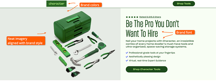
By focusing on a specific color scheme and font, this landing page creates a cohesive brand identity. The images used also align with the brand’s desired image. Similarly, other offers from ClickFunnels follow this same branding approach, making them instantly recognizable.
Building a recognizable brand is a long-term strategy, but it’s essential if you want your landing pages to stand out from the competition and achieve higher conversion rates. It establishes trust, credibility, and authority with your audience.
To implement this tip, start by selecting a color scheme using tools like Coolors. Then, maintain consistent typography across all your marketing channels. Finally, ensure that your tone of voice aligns with your brand’s desired image.
Don’t underestimate the power of a recognizable brand. It’s the key to success in every marketing channel and campaign you create.
Tip #7: Show Your Offer in Action
Want to increase your conversion rates on landing pages? Try showcasing the products you’re offering.
When people can visualize what they’re getting, even if it’s a digital product, they’re more likely to feel a sense of ownership before making a purchase.
To effectively use images of your products, make sure they’re high-quality and accurately represent what customers will receive.
Here are some examples for both physical and digital products:
1. If you’re selling books, create a visually appealing image with a stack of books and one standing upright. Pair it with testimonials from recognizable figures who have benefited from reading the book.
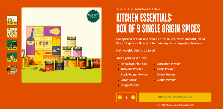
2. Check out how Vahdam highlights the features and benefits of their product with consistent branding and images. They address common objections in the images, reducing the need for excessive text.
3. Lumin takes a unique approach by showcasing people using their electric grill and enjoying a cookout with friends. The accompanying text explains the features and breaks down the benefits.
Remember, the goal of using these images is to help customers envision owning the product. This makes it more likely that they’ll convert.
For digital products, like a daily newsletter, it can be challenging to create compelling images. However, The Tonic succeeds in turning their newsletter into a featured image that captures readers’ attention.
Similarly, Your First Funnel Challenge uses an image that reflects the event rather than the product. This image helps establish trust and allows visitors to imagine themselves participating in the challenge with Russell.
Consistent branding is key across all these examples. The font type, image style, and color scheme create a cohesive and professional look.
As you scroll through the page, you’ll notice how each image complements the surrounding copy, enhancing the overall message.
Ready to supercharge your landing pages? Try incorporating these strategies and see your conversion rates soar.
And don’t forget to grab a copy of Jim’s Copywriting Secrets for even more guidance on creating strong landing pages.
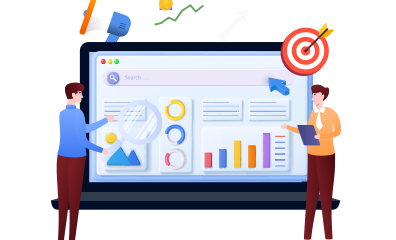
Tip #8: Split Test Your Ideas & Angles
Building a successful landing page is an ongoing process. Even if you have a high-converting page, it’s crucial to continuously test and improve it to maximize your conversion rates.
One powerful way to do this is through A/B split testing. Start by identifying your “control” page with the highest conversion rate, and then experiment with different elements like headlines, calls to action, design, and sales angles to push your conversion rates even higher.
By using split testing features in tools like ClickFunnels, you can direct traffic to different versions of your page and measure the results. Remember to focus on one element at a time, and use the winning version as the control for your next test.
Creating a hypothesis is a key step in split testing. Develop a clear statement that explains what element you want to change, the expected outcome, and the reasoning behind it. For example, changing the headline text to emphasize the benefit to the user can increase click-through rates.
Just look at this example from the Your First Funnel Challenge. The initial version of the page was cluttered and busy, but by tweaking the design, they achieved higher conversion rates. Remember, make one change at a time during split testing to accurately measure its impact.
You can experiment with various landing page elements like headlines, CTAs, layout and design, images, and copy. Each element can influence your audience’s engagement and trust, so test them individually to determine their effectiveness.
Remember, when running split tests, focus on one change at a time to accurately assess its impact. ClickFunnels 2.0 offers an A/B split testing feature that can help you run smart tests and develop strong controls.
Don’t miss out on the opportunity to convert your landing page visitors into leads and customers. Implement these strategies to create highly relevant and attention-grabbing landing pages that effectively drive conversions.
Give ClickFunnels’ A/B split testing feature a try now and start optimizing your landing pages!
>>>Join The One Funnel Away Challenge<<<