Free
5 Crucial Elements Of A Winning Landing Page
Creating a winning landing page doesn’t have to be difficult. By understanding the essential elements and why they work, you can confidently build a page that converts right from the start. Plus, mastering these fundamentals will save you time and frustration, while boosting the effectiveness of your split tests.
In this guide, we’ll break down each element you need to include on your landing page to entice people to take action on your offers. But if you’re short on time and want the highlights, check out the handy chart below.
Ready to create your landing page now? Use ClickFunnels for an easy and effective solution!
The Hero Section: Make a Strong First Impression
The Hero Section of your landing page is crucial for making a positive impression on your visitors. It’s your first chance to draw them in, and if you get it wrong, it may be your last chance. This section includes your headline, subheadline, a product image or video, and a call to action.
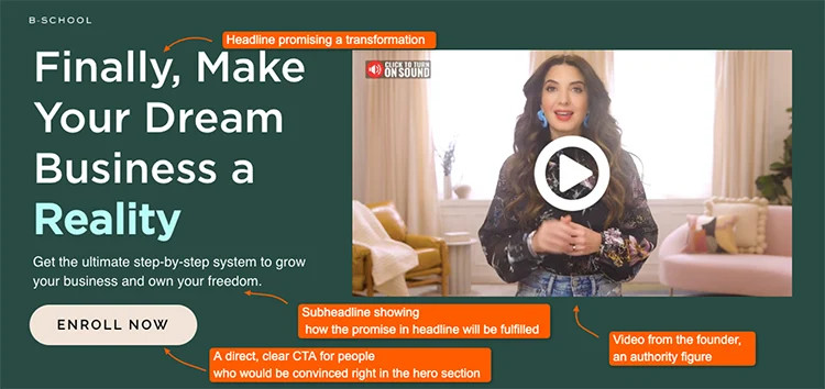
You have some flexibility in designing this section, but the key lies in your messaging. Your headline should be concise yet powerful, conveying the big promise of your offer. Use the subheadline to provide additional context, address objections, or highlight the benefits of taking action now. Keep it short and sweet to maintain interest.
Take a look at this example from Kitchen Essentials:
Headline: “Turn Ordinary Meals into High-End Restaurant Quality Dishes”
Subheadline: “Discover a curated selection of premium spices from India, conveniently delivered to your doorstep.”
Product image: Showcasing the spices included in the kit
Call to action: Guide visitors toward their next step in the journey, such as buying the kit.
By combining these elements, you create a compelling narrative in the hero section that motivates visitors to take action or continue reading.
Benefits Sections: Clearly Communicate Value
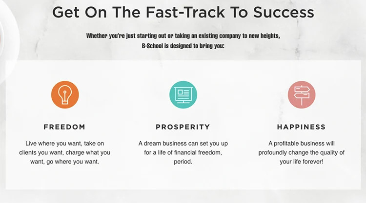
While the Hero Section is powerful, it’s unlikely to drive immediate action alone. That’s where the Benefits Section comes in. This section communicates the value your product or service provides and sets you apart from competitors.
To capture visitors’ attention, you need to answer the “why” behind your offer. While features explain what your product does, benefits explain why they should care. Connect your product to their needs, desires, or problems to address.
Here’s a tip: Run a quick test called “So you can…” to convert features into benefits. Start with the feature, such as running shoes with gel inside, and add “…so you can…” to draw out the benefit. For example: “Running shoes with gel inside so you can experience pain-free walking and reduced foot fatigue.” The benefit is clear: pain-free walking and reduced foot fatigue.
When writing your benefits, prioritize the most significant and unique ones. Be specific and use language that speaks directly to the user. Instead of “save time,” say “cut your editing time in half.”
Remember, your benefits section should clearly articulate why your product or service matters to the visitor.
Follow these guidelines, and you’ll be on your way to creating a winning landing page that drives conversions. Get started now with ClickFunnels!
First up, let’s talk about the importance of social proof. But it’s not enough to just throw a bunch of testimonials on your page. You need to present them in a way that truly resonates with your visitors. Here are three ways you can do that:
Dedicated Testimonial Section: This is a common approach where you showcase testimonials from satisfied customers. Place it strategically below the benefits section and above the final call-to-action to build trust before making your pitch. Make sure the testimonials focus on how the users benefited from your product, not just generic praise.
Sprinkled Throughout: Another strategy is to incorporate social proof throughout the page. Use testimonials to back up important claims or insert them near your call-to-actions to reinforce the decision-making process. You can also include them in footnotes to highlight benefits or success stories relevant to the section.
Above The Fold: To use social proof effectively, display logos and trust symbols in your Hero Section. Feature prominent clients, media mentions, or notable awards that your audience will recognize immediately.
Next, we have the Call-To-Action Zone. This is where you give your visitors a clear path to take action. Make sure this section includes:
Summarized Offer: Emphasize the benefits of your product or service. Use benefit-driven bullet points to highlight the critical aspects.
Anchoring & Validating The Price: Instead of just stating the price, anchor it to something your audience is familiar with. Show them the value they’ll receive at the price you’re offering. Be clear about what each price point offers in terms of value, especially if you have different tiers or packages.
Don’t forget to create a sense of urgency for discounts and promotions. Highlight that these are special deals or limited-time offers to create some urgency.
Lastly, if you offer different payment options, make sure to indicate which options are accepted.
Ready to create your winning landing page? Start now with ClickFunnels and make an impact with your audience!
Ready to take your landing page to the next level? It all starts with your call-to-action (CTA). Once you’ve presented your offer and set the price, it’s time to ask your audience to take action.
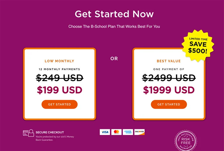
Make your CTA stand out by using phrases like “Grab Yours Now,” “Start My Free Trial,” or “Join The Challenge.” You want it to be clear and direct, leaving no doubt about where to click.
But that’s not all. Your FAQ section is another essential element for success. It builds trust and addresses any questions or concerns your audience may have. By keeping them on your page, you increase the chances of making a sale.
If your product is simple or free, you may be able to skip the FAQ section. But if you’re charging a premium, make sure to answer genuine questions that have been asked before. This will help overcome objections and boost conversion rates.
Now that you know the key elements of a winning landing page, it’s time to put them into action. Save time and energy by using ClickFunnels 2.0, a software that offers professionally designed templates and a drag-and-drop editor. No coding skills required!
Start your free trial of ClickFunnels 2.0 now. Remember, creating a winning landing page doesn’t have to be complicated. With the right elements and tips, your landing pages will perform at a higher level without frustration or wasted energy.
>>>Join The One Funnel Away Challenge<<<


